
The holiday season is here. Your Halloween, BFCM, and Thanksgiving campaigns must be in full swing right now. In this post, our focus will be on Christmas, where we’ll explore some of the best Christmas emails and try to understand why they work.
1. Tushy
Subject Line: Find out what’s on Santa’s mind … and coming out of his behind 🍑💦
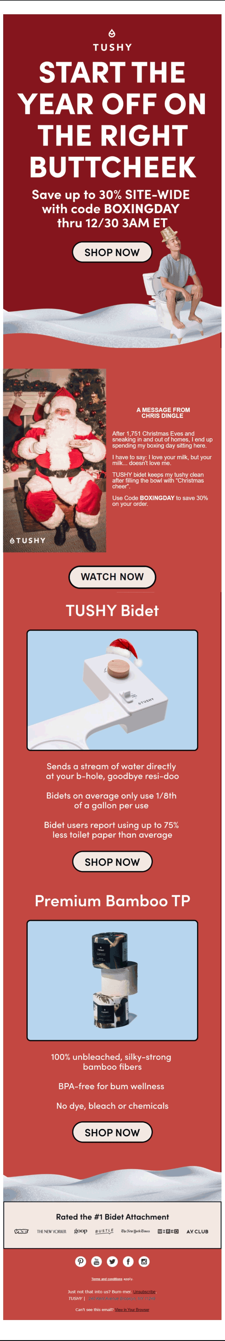
Tushy’s Christmas email starts off with a killer heading. By not framing it in the form of a question, Tushy enhances the appeal of the heading, leading the viewer tactfully on to the sales reveal just below. Your curiosity is teased and you want to see what lies ahead.
In keeping with the Christmas spirit, the entire email is infused with a vibrant shade of Santa red. The very first section inaugurates the mood of the season with a snowy landscape. The color segues into a lighter shade in the succeeding sections of the email, serving to redirect attention toward the information presented within.
The video thumbnail in the next section repeats its loop twice and poses no significant cognitive demands, ensuring an uninterrupted viewing experience. The testimonial from Santa himself is a stroke of genius. The sales details, cloaked as it is in winning content, avoid coming across as repetitive or imposing.
In the concluding promotional sections, Tushy manages to incorporate humor, product description, and social proof in one final grin. Even the unsubscribe option is aligned with their brand identity. The snowy landscape returns, providing a perfect denouement to the Christmas theme of the email.
2. Shinesty
Subject Line: We Tickled Santa’s Sack & Here’s What Fell Out
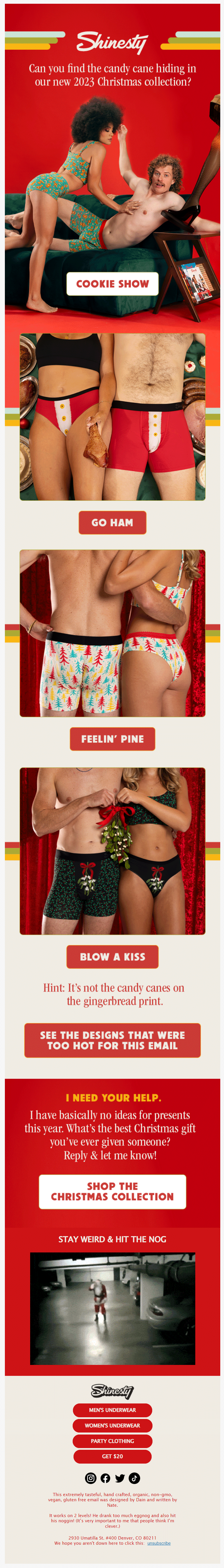
Shinesty’s email for Christmas stands out as the finest on the list. Instead of kicking things off with a promotional heading and a juicy offer, Shinesty plunges the viewer into action. You find yourself irresistibly scrolling, eagerly searching for the elusive candy cane.
Similar to Tushy, Shinesty employs the iconic Santa red, accented with white toward the middle, creating a visual ambience that resonates with the holiday spirit. Notably, the color scheme is also in sync with the brand’s palette. All the CTAs incorporate the timeless pairing of red and white. In fact, the products themselves feature subtle elements of strong color symmetry.
Having fully engaged your visual perception, the email now introduces the brand’s Christmas-themed products. The CTAs are fun, tailored to the uniqueness of each product.
While your eyes are engaged to the max, the sudden hint in the middle of the email jolts you back to your hunt. You are made to scroll back up and view the products one more time. This is how Shinesty keeps you focused on their products.
3. Food 52
Subject Line: Sicily’s best-known Christmas cookie (for good reason).
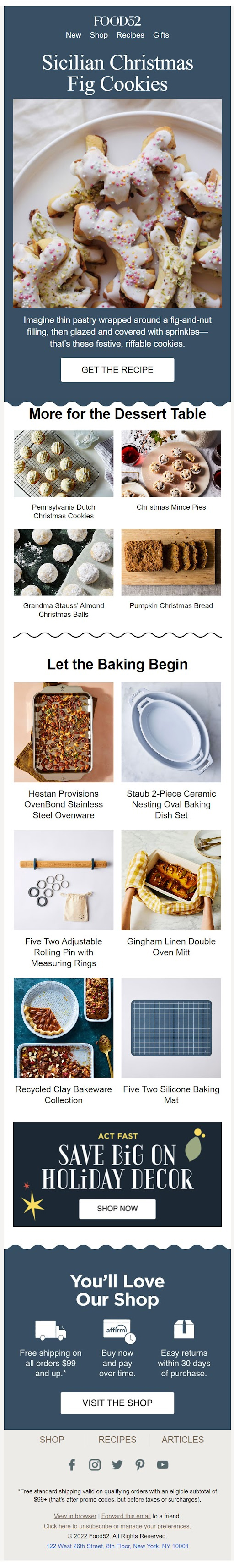
Images are the backbone of an online food business. When the occasion is Christmas, including high-res images becomes critical. The success of Food 52’s Christmas email is not primarily due to the images themselves but rather to their strategic arrangement that avoids cluttering the template.
The email uses a clean layout with sufficient negative space around the images. The style and spacing between the images is consistent throughout the email. The grid layout works perfectly. The images are appropriately sized for their intended placement across the template. The overall visual hierarchy of the email inspires spontaneous engagement.

4. Framebridge
Subject Line: Need it by Christmas? Order by 3pm EST!
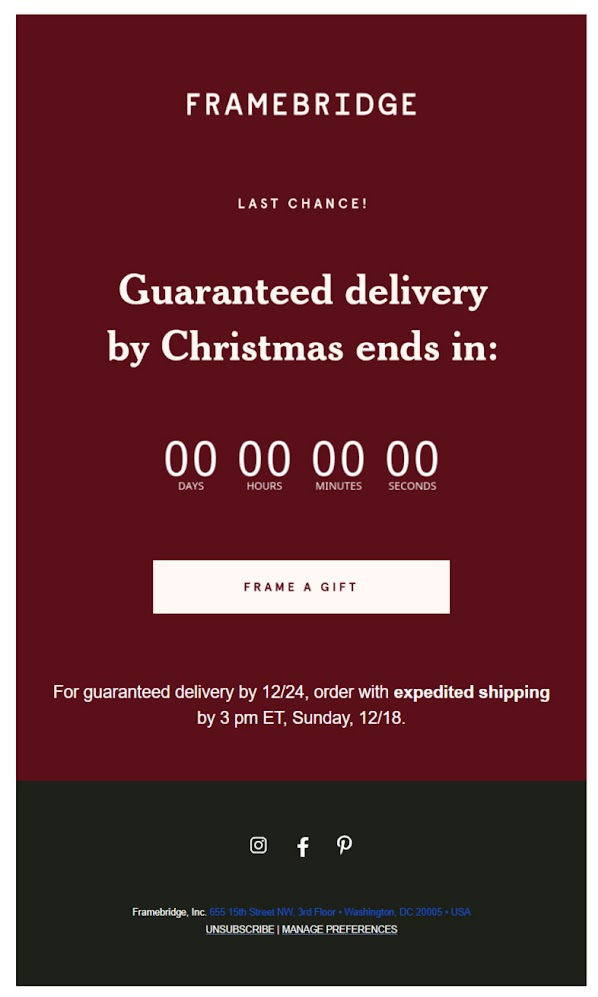
Burgundy is not the color typically associated with evoking urgency. Its warm undertones inspire a feeling of coziness and comfort. Which is why it’s often employed by wine brands and such. Framebridge might have chosen burgundy because of its association with fall. Nonetheless, the email has an instant impact that emanates an aura of elegance and sophistication.
Usually, brands tend to limit the use of serif typefaces to the heading of an email. Their intention is to present the crucial information in a sans serif font. Framebridge takes the opposite approach for a reason.
Objectively speaking, serif fonts are associated with formality, inspiring trust and credibility. Some people also tend to associate the serif typeface with a warmer, more personable tone.
In one study, the use of a serif font resulted in a 9% enhancement in attention and recall. This may be one reason why Frambridge uses this typeface. In addition, since there are no images in this email, the use of a decorative font is justified.
5. Uncommon Goods
Subject Line: 🚨This stuff sold out last Xmas🚨

Imagine an entire email devoted to social proof. This Christmas email example is just that. It’s a masterful way to showcase your products. The viewer is immediately hooked.
Offering a fascinating selection of their most popular products, Uncommon Goods captures the whole ecommerce experience in a single email. By including links that lead directly to the respective product pages, the email ensures seamless transition to the website.
The blue-white color scheme serves as an amiable background for an email so admirably hectic with different kinds of products. Blue and white can help visually organize a space that is full of images. Justifiably, the dominant product image in each section is immersed in blue, while the accompanying images in white. The email effectively tiptoes the thin line between cluttered and clean.
The images are high-res. Text is minimal since the products speak for themselves. The email provides additional relevant links at the end, and concludes with a simple GIF, capping off the social proof tableau.
6. Email Uplers
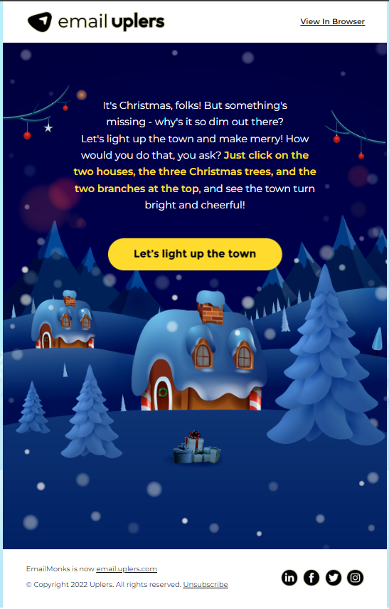
Notwithstanding their compatibility issues, interactive emails are gaining popularity. Which is why last year, we chose to design an interactive Christmas email for our audience. Our primary aim was to entertain our audience and also to inspire them to “share the vibe” with their friends and family.
It didn’t have to be too complicated. But we wanted to make the design sober yet not dull; soothing to the eye, yet not inordinately muted.
As you can see, our email features a restrained palette. The template incorporates a range of blue and white tones. Its appearance is marked by simplicity and cleanliness, achieved through the use of two-dimensional elements and the avoidance of excessive gradients or shadows.
You can view the email and light up the town yourself right here.
7. Whittard
Subject Line: Christmas Gifting Made Easy
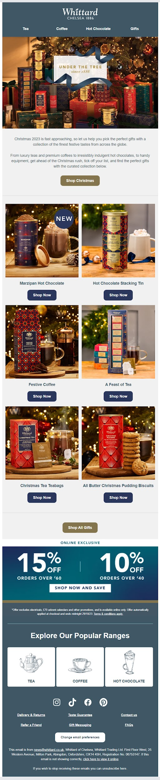
Any email from Whittard is singularly eye-catching thanks to their wide range of fascinating products. Their Christmas email is no exception.
To begin with, the hero image is tantalizing. The product images throughout the email are shot with such finesse that it cannot but draw in the viewer, leaving them almost endlessly zooming in on the products to capture the details. The all-white background was non-negotiable given the intricacy of each product image.
The images and their respective CTAs are enclosed in sharp-edged frames for the images and round-edged frames for the CTAs. While there is no reason why it could not be the other way around, the point of employing both is to introduce visual contrast and aesthetic variation. It contributes to a balanced, well-composed design.

8. That’s Arte
Subject Line: NEW, fantastic, Christmas ornaments
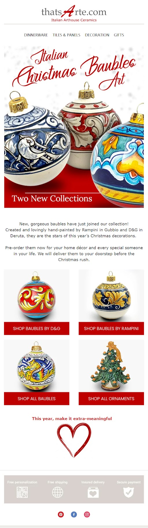
“Vibrant” is the first word that comes to mind when you see this Christmas email in your inbox. Like our previous example, this email succeeds in its beautiful product images without having to resort to extraneous tactics. The high-key lighting produces a high-contrast, vivid, and airy aesthetic.
In contrast to the previous example, there does not seem to be much going on in this email, both in terms of content and product display. The hero image is so rich and vibrant that it commands the entire email with singular panache. The heading font is equally festive, enhancing rather than limiting readability.
Our sole concern pertains to the excessively grayed-out footer. This forces the viewer to strain their eyes, requiring them to squint in order to discern the widgets.
9. Perch & Parrow
Subject Line: Deck the Halls
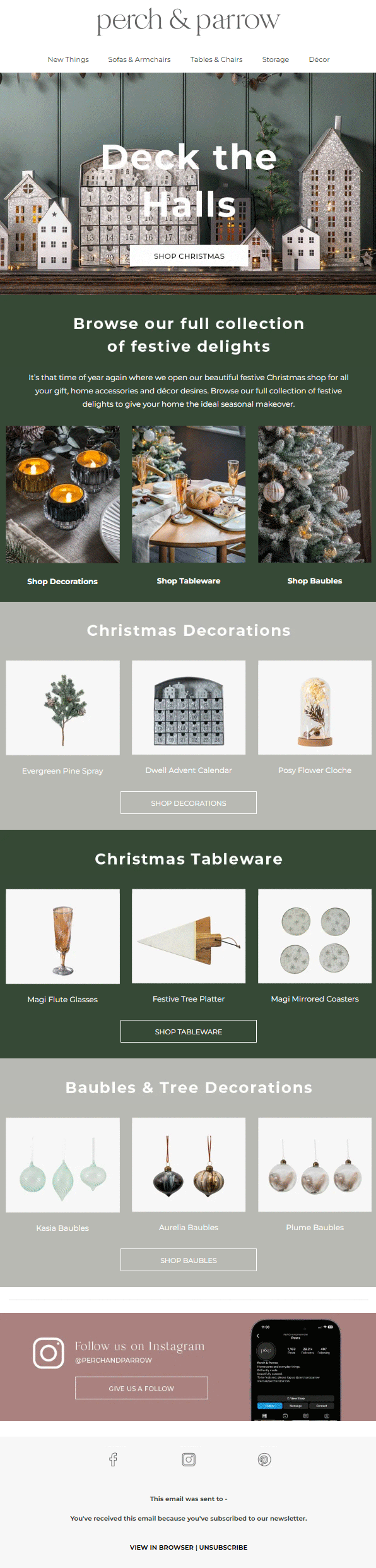
Starting an email with a GIF can be quite effective. It immediately captures the viewer’s attention, compelling them to scroll further down.
However, we don’t recommend superimposing text and a CTA button onto the GIF. It affects readability, and forces the viewer to revisit the loop quite a number of times.
The email shifts consistently between sea green and light gray, in tune with the general color profile of the featured products. The CTA buttons are a tad too inconspicuously simple, redeemed only by the serif typeface that lends some weight to the buttons, making them noticeable.
10. White Stuff
Subject Line: Christmas is coming 🎁

Our last Christmas email example is a visual treat. As we mentioned in our earlier example, this demonstrates the proper use of a GIF in the heading. There’s no text or CTA overlay. In fact, the CTA is positioned outside the GIF section for easy visibility. The use of light colors across the email aligns perfectly with the cheerful theme of the template.
The majority of the products are framed by white “sketch borders,” adding a casual and enjoyable vibe to the email. Toward the end, there’s a concise bonus guide that pleasantly surprises the reader, serving as a thoughtful detour that reflects the brand’s customer-centric approach. It’s a reminder that promotion isn’t the sole focus; providing value matters too.
Wrapping Up!
These were some of our favorite Christmas emails. Each email demonstrates the creative potential of this medium. Notwithstanding their individual differences, they share a common emphasis on innovation, entertainment, and informative content.
From a technical perspective, the emails excel in all the following areas:
- Accessibility
- Responsive design
- Consistent branding
- Clear CTAs
- Personalization
Looking for responsive email templates? We will be your dedicated email geeks. Share your creative concepts with us, and we’ll expertly craft them into email templates that drive impressive conversion rates. Get in touch with us!
Susmit Panda
Latest posts by Susmit Panda (see all)
How to Achieve An Increase in Email Newsletter Subscribers During the Holiday Season?
An Omnibus Guide to Verification Emails (Plus Examples And Bonus Content)