
Get a 360° Responsive Email Design Approach for Your Campaigns
We (Monks) pride ourselves on having the expertise of coding over 30000+ email templates for our 3500+ customers globally. The amount of love we receive for it is tremendous. The takeaways we got from it shall be:
- No two emails are same.
- Email is not dead.
- A/B test every email.
- Subject line length or CTA button placement varies from person to person.
And finally…
- It’s time for emails to be RESPONSIVE.
Be it welcome emails, transactional emails, re-engagement emails or any other email template; the designing and coding of responsive emails have its own challenges. Monks (with all the accumulated experience) shall guide you on the tips to be used for a Responsive Email design.
71% of subscribers ‘unsubscribe’ from email list. Can responsive email design help?
Imagine a scenario wherein you receive an email on your mobile. You open it and noticed it to be of fixed-width. Would you constantly swipe right and left to go through the email? If your answer is ‘No’ you are not an exception! In fact, it is one of the most dominant reason why majority of email subscribers unsubscribe from any non-responsive emails as per a survey by BlueHornet.
Responsive email design uses CSS3 media queries to display different layouts of an email depending on the size of the viewing screen. You can display or hide elements for a true mobile experience. By optimizing your email for mobile devices, you observe following improvements:
1) Enhanced User Experience: Subscribers can navigate with ease and don’t have to swipe, pinch or zoom to read the content of your email. Moreover thumb friendly CTA buttons makes it tappable without much effort.
2) Increased Conversion Rate: Enhanced user experience leads to more customer engagement and in turn increases conversion rate.
3) Reduced Unsubscribe and Spam complaints: When subscribers are engaged in your content and relate to it, it indirectly means that the unsubscribe rate shall be low and also decrease spam complaints.
4) Higher Click-to-Open: A recent study by MarketingProfs has revealed that responsive emails have a 21% higher click-to-open rate (11.9%) than non-responsive ones (9.8%).
5) Bigger Sales: Responsive emails render perfectly on all types of devices, creating a great first impression with your customers. With most amount of online shopping done on mobile devices, a well rendered email can translate into bigger sales.
Making Responsive Emails…‘Responsive’?
The most important factors that separate a responsive email design from standard HTML emails is a combination of flexible layout and media queries.
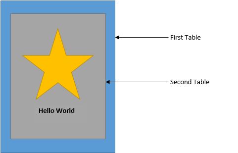
Any layout in emails is made using tables in the email body. Tables are nested within outer tables to generate appropriate layouts.
|
1 2 3 4 5 6 7 8 9 10 11 12 13 14 15 16 17 18 |
<table border="0" cellpadding="0" cellspacing="0" width="550"> <tr> <td> <table> <tr> <td> <img src="images/xyz.jpg" width="280" alt="" /> </td> </tr> <tr> <td> Hello World </td> </tr> </table> </td> </tr> </table> |
This table shall make a table containing an image and a comment, nested within a larger table (of 550px) as shown below
To make this above table flexible, you need to add the tag class= ‘wrapper’ to the outer table.
|
1 |
<table border="0" cellpadding="0" cellspacing="0" width="500" class="wrapper"> |
The class=”wrapper” is defined by the media query. Media query make use of defined breakpoints, as per which the layout gets rearranged according to the device.
|
1 2 3 4 5 6 7 8 9 10 11 12 13 |
@media only screen and (min-device-width : 320px) and (max-device-width : 480px) { table[class=”wrapper”] { width:50% !important; } } |
So the final code looks like:In the above example, the media query is only applicable to those devices whose screen width is between 320 to 480 px. The class=”wrapper” ensures that the table is aligned to 50% for the above media query.
|
1 2 3 4 5 6 7 8 9 10 11 12 13 14 15 16 17 18 19 20 21 22 23 24 25 26 27 28 29 30 31 32 33 34 35 36 37 38 39 40 41 42 43 44 45 46 47 48 49 50 51 52 53 |
and (min-device-width : 320px) and (max-device-width : 480px) { table[class=”wrapper”] { width:50% !important; } } . . . (Here come remaining code for defining other . styles and header of your emails) . . . <table border="0" cellpadding="0" cellspacing="0" width="550"> <tr> <td> <table> <tr> <td> <img src="images/xyz.jpg" width="280" alt="" /> </td> </tr> <tr> <td> Hello World </td> </tr> </table> </td> </tr> </table> |
!important is necessary as inline styles overwrite styles contained in media queries. In such case, the only way for the styles in a media query to take precedence over inline styles is by using !important.
Compatibility
- Media queries are supported on iOS 7, iPad, AppleMail, and webmail clients.
- Even in case of iOS, iPad initially had 1024×768 display whereas 2nd generation onwards has retina display (so twice pixel density), so in that you need to specify another parameter in case of iPad 2nd Generation.
|
1 2 3 4 |
@media only screen and (min-device-width : 768px) and (max-device-width : 1024px) and (-webkit-min-device-pixel-ratio: 2) |
Outlook 2007, 2010 and 2013 ignore max-width and min-width. You’ll therefore need a bypass in order for emails to display correctly.
|
1 2 3 4 5 6 7 8 9 10 11 12 13 |
@media only screen and (min-device-width : 320px) and (max-device-width : 480px) { table[class=”wrapper”] { width:50% !important; } } |
Best Practices to employ while designing Responsive Email Templates:
- Depending on your content, use a single-column or a two column design, so emails look flawless on any size screen.
- Design with finger targets in mind: width should be a minimum of 320–550px.
- Make CTAs easily tappable: minimum of 44px.
- Use white space wherever possible to make the email easier to skim.
- Keep the header clean. Put navigation (if any) in the footer so users see your primary message without having to scroll.
- Optimize for retina devices. It’s the future of mobile devices.
- Don’t crowd your links. Put text links on individual rows and convert them to buttons for mobile view.
- Provide tappable phone numbers for mobile, so users can easily call with a single touch.
- Limit subject lines to 30 characters or less.
- For the desktop view, use image width of minimum 480px. At this size, when it’s scaled for mobile, it won’t get blurry.
- Restrict the length of your emails. Subscribers often skim first, deleting any email that’s too long to easily read on mobile.
- Place an important CTA above the fold.
- Before sending, test your responsive email design and make sure it’s compatible across all major email clients.
- When you use display:none to hide the images that don’t fit on the screen you’re actually telling the mobile device to download the image but not display it which is a total waste of bandwidth.
What is your responsive email game plan? Got something new to share? Start the conversation in the comments below.
