
Email is flourishing and with more and more users and brands using it for business communications, it continues to be part of everyday life across all age groups. But, the question here is: Are you reaching your potential target group and making your emails accessible for everyone in your target group?
What about the people who are visually challenged? How do people who have difficulties in hearing or understanding use your email?
Well, here are some facts:
- Around 253 million people live with vision impairment worldwide, of which 36 million are blind and 217 million have moderate to severe vision impairment.
- There are close to 300 million people who are color blind.
- People with disabilities use the web and email as much as others, thanks to adaptive technologies and tools such as screen magnifiers, eye tracking systems, and advanced sip n puff devices.
It is, therefore, necessary to design and code emails that everyone can receive and understand, regardless of any physical or mental disabilities.
What is Accessibility in Emails?
Email accessibility is the practice of designing your email content in such a way that it removes barriers for your subscribers with disabilities and lets them access, perceive and interact with the content. Not just for people with disabilities, but accessible content is more readable, logical and more usable by everyone.
Good accessibility means good usability and good usability means good business!
Making your Emails Accessible: Best Practices
Let’s check out ways to make emails accessible.
Design Considerations
Email designing and content plays a major role in making it accessible to everyone. To meet basic accessibility requirements, your email must have the following:
Maintain a Logical Reading Order
Establish a logical order and maintain a hierarchy of your email content. Irrespective of their screen size, your subscribers should be able to view the content of your email in a logical reading order. This will especially help people with cognitive disabilities and subscribers using screen readers. Also, a logical order will help users to pull out the key information quicker.
Use Large and Readable Fonts
Keep visually challenged viewers in mind while setting the font style and size of your email. Fonts lesser than 14pt become hard to read on desktop or laptop screens. Keep the text evenly spaced and keep the size above 14pt so that it is easily readable. Minimize the use of multiple font styles and typefaces that make it appear condensed.
Keep the Content Simple
Avoid flashy content and keep it as simple and short as possible. Get straight to the point and avoid using complicated layout and metaphors. Avoid justifying your copy and highlight the important areas of your message.
Use Enough White Space in your Copy
Reading paragraphs and heaps of content that are spaced together requires a lot of efforts. It is important to give proper spacing to the text and create enough white space around the copy to make it easy to read. Set appropriate line heights to the text and add padding to the tables and images in your content. People who read your copy must be able to scan it.
Use the Right Color Schemes
Complex colors can be confusing for those with color vision deficiencies and hence consider how viewers perceive different colors and choose a color scheme accordingly. Use the right colors in email, maintaining the basic color arrangement of dark text on light backgrounds and light text on dark backgrounds to ensure the content is easily distinguishable.
Include a Text-Only Option
Your emails should have both plain text and HTML options while signing up. While the HTML emails will load the images, the text-only email will load only the text and let the users read the email comfortably. A plain-text version of your email can be of help especially to those using screen readers since they provide only the core content of your emails.
Make the Clickable Links Prominent
Keep the clickable links large and visible, especially for those who have issues in controlling a mouse with precision. Keep the link differentiated from the images and make sure the link text describes what’s in the link. Tell your readers what to expect from the link by writing contextual link text. For example, instead of just saying “Click Here”, make it more precise by saying “Click Here to View the Products!”.
Keep the Email Design Responsive
Keep the design responsive so that it is compatible with mobile devices, screen readers, and all other major devices. Maintain proper text-to-image ratio and highlight the main message so that the message is conveyed clearly, irrespective of the device and email client in which the subscribers view it.
Use Precise Subject Lines
The subject line is the first and the most critical attribute of your email. Keep the subject lines brief and to the point. The subject lines should give the subscribers clarity in knowing what’s inside your email. Clear subject lines not only make your emails easy to access but also improve the overall subscriber engagement.
Coding Considerations
Using HTML typography while developing emails will help in rendering the emails compatible with accessibility. Here are a few ways of implementing them into your code:
Use Semantic Tags
Header elements in emails such as <h>, <p> and <table> ensure hierarchy to subscribers using screen readers, who may not be able to scan through your emails otherwise. Instead of using style statements like bold text and colors, use semantic tags such as <h1>, <h2> and <p> that will identify and differentiate the important sections of your content.
Use Proper Alt Text for Images
Include proper alt text for the images in your email to describe the image when a subscriber cannot view your images. Make sure the text clearly describes the image.
Examples of Accessible Emails
Here are some examples of brands sending emails that are accessible and compatible with various devices and email clients.
Example #1

Email Uplers has included all the principles of accessibility in this email, sent in order to share their infographic on the same topic. At the end, there is a CTA that directs the reader to the landing page that talks about how this email has been tested for accessibility.
Example #2

Source: Really Good Emails
This is a text only email from Cameo. The important parts of the content are displayed in bold and the links are displayed in a different color to differentiate them from the rest of the content.
Example #3

Source: Really Good Emails
This email from SurveyMonkey has very little content that is displayed neatly. There is enough white space in the email that makes the email easy to perceive. The colors of the CTAs and images are contrast to the white background, making it clearly visible.
Example #4
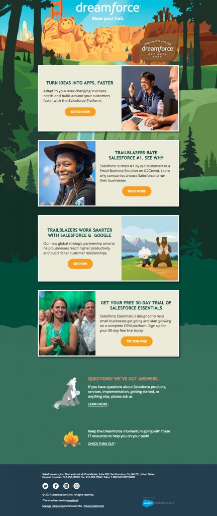
Accessibility was the priority while coding this email by Salesforce: border-bottom is implemented for text links, header and paragraph tags are used, and each table is assigned the attribute role=”presentation”. CTAs with rounded corners are used. It’s all HTML text, so it remains a good experience even when images are turned off or background images are not supported.
Wrapping Up
Keep these points in mind while designing and coding your emails. If you need help in getting accessible emails created for your business, get in touch with us.
Kevin George
Latest posts by Kevin George (see all)
Live Shopping Cart in Cart Abandonment Emails
[Update] Integrated Forms in Email: Apple Mail now supports multiple text boxes