Email

Opt-ins

Convert your visitors to

subscribers like a pro!
Opt-in form in email

Why is the time now for brands to better their opt-in workflow?

We’ve noted that the amount of global traffic increased 3x but more importantly, the number of websites increased 14x, which means the competition levels are higher in most markets.

1% delay in website’s page load time leads to a 7% decrease in conversions.

60% of traffic is “smart” which means having a great conversion mechanism for on-the-Go recipients is vital.

That being said, opt-in forms and opt-in email marketing, in general, is the best way to capture visitor information and in turn use big data to nurture and convert these leads.

10 EMAIL OPT-IN FORM Examples

  • Sign up Opt-in form Example

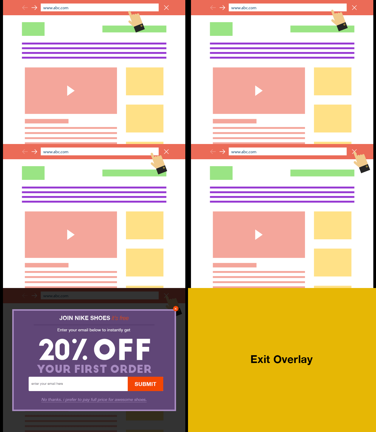
    Exit-intent

    A pop-up box that appears once the user moves their mouse pointer to close the page/tab

    • Pros: Grabs attention and might give you a last chance to convince your visitors to stay connected, in the long run could help you improve your churn rate
    • Cons: Similarly to light-boxes, can be overused and cause annoyance especially if difficult to close
    • Pro tip: Make sure that the presented benefit is something they are truly interested in and is worth their time.
  • Sign up Opt-in form Example

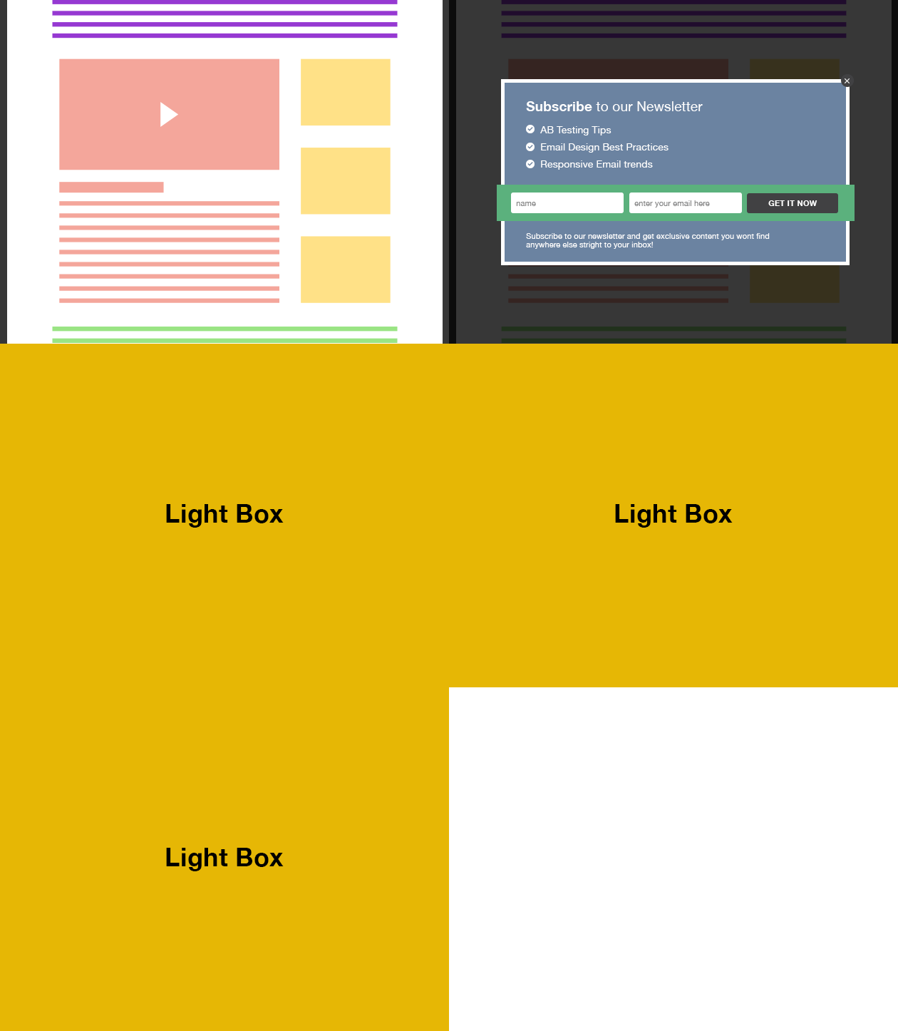
    Light-box

    A pop-up box that appears after a certain amount of time passes once the user enters a website

    • Pros: Instantly grabs attention and drives user action, thus helping to maximize conversions
    • Cons: Easy to become overly used and can cause annoyance
    • Pro tip: Test the amount of time before the light-box appears and try using funny/clever, graphic elements to motivate sign-ups.
  • Sign up Opt-in form Example

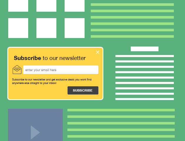
    Embedded email sign-up form

    A regular good ol' sign-up form embedded onto your website.

    • Pros: If designed well i.e. fits the overall design, good copy, clear benefits and CTA - can motivate to sign up
    • Cons: May not be enough to catch attention unless your visitor is looking for a newsletter sign-up
    • Pro tip: Should be visible on all the major pages of your website.
  • Sign up Opt-in form Example

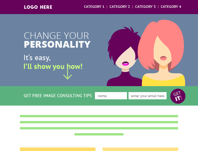
    Bar

    A short sign-up form that looks like a bar that can be placed on top, side, or bottom of your page

    • Pros: Instantly visible yet subtle
    • Cons: Limited space, but can be part of a two-step sign-up process
    • Pro tip: Use contrasting color and a catchy line to quickly grab users’ attention.
  • Sign up Opt-in form Example

    A Checklist

    If you’re confused as to what all you want to showcase to your customers, a checklist is your best bet. Besides, it also facilitates a greater user experience as the choice now rests entirely with them.

    • Pros: Allows you to capitalize on the users responses and send them recommendations and marketing emails that align directly with what they opted from.
    • Cons: The items that you curate for your checklist might fail to paint an accurate image of your business, leaving audiences with convoluted perceptions.
    • Pro tip: Don't make your checklists too long; 6-10 items are considered ideal.
  • Sign up Opt-in form Example

    A Worksheet

    A light activity that requires your visitors to solve a small puzzle or a few straightforward problems to uncover the answer.

    • Pros: Invites interaction from your user and is a great method of teaching your audience.
    • Cons: Not everyone would appreciate having to navigate through the "hurdles" of problems to get their answer, and hence might end up disengaging altogether.
    • Pro tip: Don’t make your challenges overly complicated; remember, the end goal is to capitalize on the element of interactivity to rope in the customer, not to drive them away.
  • Sign up Opt-in form Example

    A Quiz

    A series of multiple-choice questions revolving around a few problem statements that customers in your domain typically face. Users are free to select the choice that they deem most appropriate.

    • Pros: Besides being interactive, a quiz also doubles up as a preliminary consultation call and helps you understand the expectations of your users.
    • Cons: Users may not have the bandwidth to engage with a series of questions, especially when they have no prior notion of your brand.
    • Pro tip: Make sure that all your questions revolve strictly around your brand- either your products or services, the problems that you tackle, the uniqueness of your solutions, and the like.
  • Sign up Opt-in form Example

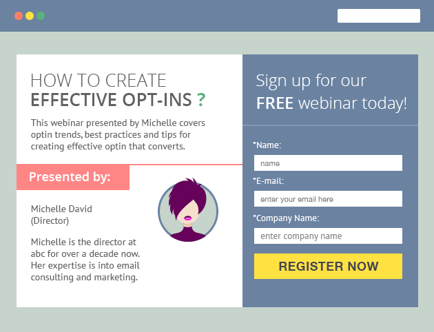
    Webinar sign-up

    An additional check-box allowing your users to sign up for a newsletter as well as a webinar of their choice

    • Pros: A great way to attract new subscribers who are already interested in your topic
    • Cons: Visitors may be reluctant as they might assume that they'll receive purely sales-oriented communication
    • Pro tip: Clearly communicate the frequency and the content of messages that your visitors are likely to receive if they sign up.
  • Sign up Opt-in form Example

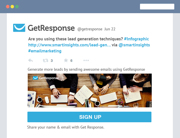
    Twitter Lead Generation Cards

    A sign-up form that allows you to turn your Twitter followers into newsletter subscribers

    • Pros: The easiest way to attract leads from Twitter other than redirecting your traffic to dedicated landing pages
    • Cons: You have to pay for the generated leads, which means you need to devote additional financial resources
    • Pro tip: Select your audience carefully and design your ad with their personas and preferences in mind to make the best use of your budget.
  • Sign up Opt-in form Example

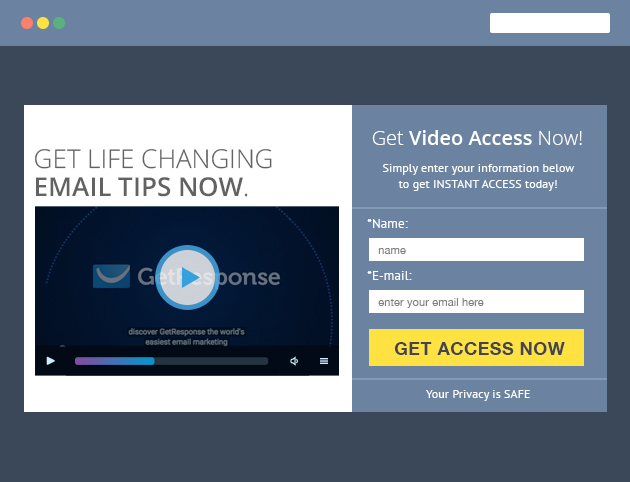
    Video opt-in

    A lead form that appears to users after they have watched a part of your video content

    • Pros: A growing number of users prefer to watch videos and if you can entertain and educate them, building a list won't be a problem
    • Cons: Users may be annoyed by ads and other similar elements that prevent them from watching the video
    • Pro tip: Great videos are worth waiting for. Serve them enough content to gain their interest and convince to leave their details with you.

OK, now you know which opt-in forms to use. Just remember to do it the right way.

Here are some practices you should avoid.

NOT SO COOL EMAIL OPT-IN FORMS:

7 BAD PRACTICES!

  • 1

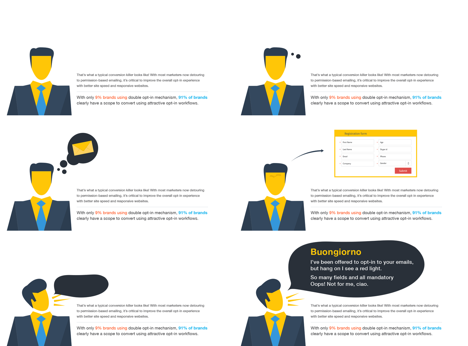
    Too many mandatory fields hampering the UX

    Capturing information is good, but a lot of information makes visitors skeptical about how it will be utilized. Above all, it also hampers the UX. Limit the form to a few fields and use surveys to find out the rest, after they've already signed up!

  • 2

    No adherence to the law like privacy links, address, and other related information

    In your preference center or sign-up forms it is always advisable to provide information which is required by law. Even the best marketers forget to provide this information, enabling users to choose between opting-in and skipping. Doing so can severely hamper the returns of your opt-in email marketing endeavors.

  • 3

    Sticking to only a single opt-in type

    From floating bars to sidebar opt-ins to welcome gates- there are multiple choices at your disposal when it comes to designing your opt-in form. To capture the maximum number of subscribers, it is advisable to make use of all these different types rather than sticking to any one style.

  • 4

    Improper sizing for on-the-go subscribers

    It is recommended that your opt-in form is designed keeping with mobile visitors in mind. Proper sizing leads to a great user experience.

  • 5

    Problems exiting the form while viewing the website

    Some opt-in forms are so bulky that they occupy the entire screen, while others are small but there is no way to exit them.

  • 6

    Not letting users initiate

    Instead of showing the opt-in form fields straight away, allow your users to initiate the process themselves. This will increase the likelihood of the user going ahead with the opt-in than when you spoon-feed them with the fields.

  • 7

    Only providing single opt-in and not double opt-in email confirmation

    While some marketers are providing double opt-in forms, others are still relying heavily on single opt-in, which isn’t a best practice.

Alright, so now you know what to avoid, let’s go through some clever ways that will make your sign-up forms effective.

SUPER COOL OPT-IN FORMS THAT CONVERT:

10 EMAIL OPT-IN BEST PRACTICES

  • 1

    One of the foremost opt-in marketing best practices includes identifying your audiences’ preferences and delivering a form that actually helps your customers through the sign-up process.

  • 2

    Use a double opt-in email form wherever possible. Not only does this ensure that the customers completing the double opt-in process have a genuine interest in your brand but also establishes your credibility. Email double opt-in best practices include ensuring that the double opt-in confirmation email has a singular focus and includes minimal content.

  • 3

    A good way of ensuring the success of your opt-in marketing is to keep the form simple, with a few fields.

  • 4

    If you want to include animation or add interactive elements, make sure they don’t distract

  • 5

    Use your opt-in copy to tell your customers what they should expect from your products and services and your brand in general.

  • 6

    Make it easy to close the opt-in form.

  • 7

    Keep the form optimized for mobile users in terms of its size, button placement and content.

  • 8

    Make sure your form is placed in the right eye-path to attract conversion.

  • 9

    Test a few opt-in forms and see which ones work best for you.

  • 10

    Offers samples of your previous newsletters or any other resources in your opt-in forms. This helps new visitors derive a compelling impression of your brand.

Craving some inspiration?

Check out these interesting ideas for mitigating the opt-in challenges!

to Get The optin Solutions cheatsheet visit :

It's great to start with these tips

but remember - you know your audience best, so run a few A/B tests to check what really works for your audience!