Email is alive and doing well with more than 68% effectiveness over most other channels of marketing.
Understanding the importance of email, Uplers had developed standard set of email design best practices in 2013.
However, to help you provide an unparalleled email experience through highly visual email designs and flawless code, we further bring to you new age email design best practices.
Don't Think just code responsive
Think mobile first!
Email opens on the smartphones have escalated above 50% whereas the number grows further to 67% if we consider
all the mobile phones and not just the smartphones. With this, designing with mobile first mentality is vital.

While going mobile first, determine the number of third party app users. For an example, the native application on the iPhone is called Mail, while Gmail, Yahoo!, Mailbox, and Sparrow also offer third-party applications for iOS.
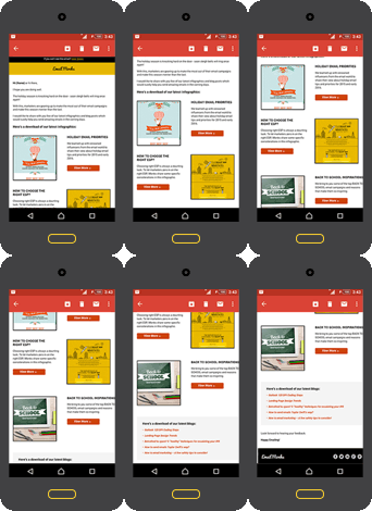
Use a single column layout if the majority of your subscribers are third party app users. The one-column format is easily legible whereas two or more columns crowd the small screen. Consider a hybrid approach to let your email look like responsive email in the third party apps that don’t support media queries. Try hybrid email sample developed by Uplers.
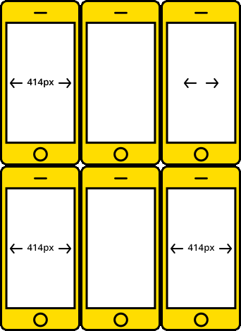
Design emails for 320 and 480 px view. Update media queries while relying on a 320 px breakpoint to 414 px for iPhone 6 Plus.

If you’re relying on the video tag for playing media in an email, you may want to rethink your strategy for now, especially with iOS 8 users. Use a still image with a play button. For others, use auto run video background in an email with fallbacks for subscribers viewing in non-WebKit programs & Apple devices! Try video email sample developed by Uplers.
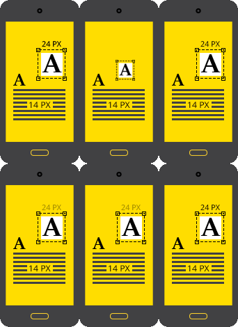
Keep the standard main body font type for mobile email between 14 to 16 px whereas keep it 22 to 24 px for the headlines. Avoid orphans and hyphenation in the mobile email copy.

Keep 44*44 px minimum CTA button size with plenty of white space around it. Spread the button across the width if possible and design separately for mobile to make it easily tappable.

Create an information hierarchy. Information secondary to the email main purpose should always come after the e-mail's main content and Calls to Action (CTAs). Use accordion to stack up verbose emails full of content. Try accordion in email developed by Uplers.

Avoid full-blown navigation bars (remember, this is not a landing page). Make the navigation intuitive using menus in email. Try menus in email developed by Uplers.
Imagery is the key to
highly visual emails.
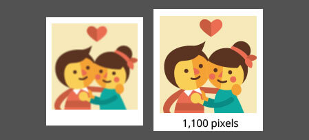
If most of your emails are opened on Apple devices, use retina images. Double the normal dimension of images to around 1,100 pixels and save them at 5% quality. This shall reduce file size by 20% with no downsides.

Make sure your images are sized correctly to avoid squishing or stretching. For fluid emails, make sure to create them in a way that they can scale up to 599 px.

Use bulletproof backgrounds & buttons as this will help displaying background images for outlook as well. However, you need to check whether your ESP supports VML (Vector Markup Language) coding, an XML-based file format for two-dimensional vector graphics.

Use creative and colorful pixel art to showcase the alt tags. While you use the pixel art in the image do think about scaling them for smaller devices.

Use GIF in emails. While doing so, set the first frame with milliseconds giving full message for outlook followed by the frames animating your message for other email clients.
Introduce yourself well with
smart pre-headers – Say cheese!
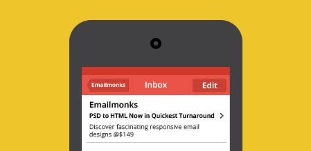
According to Salesforce survey, 41% of the businesses don’t optimize pre-headers or snippet text. It is vital to optimize the pre-headers.
-
Hey Jenny, wanna learn some cool pre-header tips?
-
Yea, absolutely!
-
Cool, so to start with, limit pre-header message to unique 85-100 characters, different from subject line.
-
Ah! Alright - True that! Does that also include view online text?
-
Great Question J! Not really. If you don’t want to show the “View Online” or any other not so important message in the pre-header, specifically define which text you’d like displaying in the inbox. Here’s the code:
-
< body> <div> This is how you define which text you’d like displaying for the preview text. </div> </body>
-
You rock boss! That’s great. And what about the fonts?
-
Well, use web safe fonts with 8-12 px size. Boldface the CTA and try using black color to stand out. Also, use punctuation, plus signs “+”, dashes and more for connecting phrases.
-
Ohh! Cool, that makes it look brilliant and a stand out!
-
Yea absolutely! You could also use left alignment for your pre-header text. This will make the text easier to read, especially on mobile devices.
-
Yes of course, we can’t forget mobile readers!
-
And last but most important, test pre-header content by viewing it in multiple email clients for an idea of how many characters recipients see. Also, test the vertical and horizontal view.
-
Yep, noted. Thanks boss for sharing great thoughts.

Header & Footer - Keep 'em tidy!
Design the header and footer keeping both desktop
and mobile audience in mind.
Add background colors to the header and footer to visually
separate them from the body content.
Abide by the laws regarding address; unsubscribe links etc. in
the footer.
-
Global wearable market is expected to grow at a compound annual rate of 35% over the next 5 years and hit 148 million units shipped in 2019; optimizing marketing emails for wearable technology viewing environment can thus not be ignored.
-
Emails are now
wrapped
around
your hand!
-
Minimalistic email design for watches because no room for display.
There is no browser on the Watch. As a result, links in the plain text version are indicated with grayed out text.
Apart from plain text, remote images stored on your server or embedded images will not render well and bring an error message.
For email marketers sending multi-part MIME messages, optimize the plain text.
Some popcorn tips
for your next movie interval!
Use grid-based layers and avoid complicated
elements that require HTML floats or positioning.
Another effective approach is to make sure
that your important content is placed in
an F-shaped pattern. Studies show
that readers will first view the headline,
followed by the text down the side and
finally the middle section of text.
Add line breaks every 60 characters in
your plain text emails to increase legibility.

Use attractive typography, but stick with
web-safe fonts like Arial, Helvetica,
Tahoma, Times New Roman, and Georgia.
Modern web fonts are supported in less
than 50% of email clients. Using custom
fonts in a text format is not stable enough
in email, so they have to be inserted as an
image into your email templates or you
can use appropriate fallback that matches
to websafe font.
Choose just one or two colors for your
emails. The fewer colors you use,
the cleaner your design will look.


