Responsive Emails
Evolution from 2013-2015 and the Journey ahead!


50% of emails were opened on mobile while we published our last infographic back in 2013,
the recent report from Movable Ink said that 67% of emails were opened on either a
smartphone or tablet in Q4 2014.
Whoa! That’s holy huge number! So, adapt to responsive email design now or provide bad user experience to more than 2/3rd of your audience. According to Campaign Monitor “Email interaction across mobile and desktop”, Mobile email opens have grown by
180% in three years.
How have things changed?
mobile will just delete it.
Which email clients remain popular for
mobile email open in 2015?
When compared to 2013, readership on Apple devices has increased from
43% to almost close to 50% which also means your responsive emails should
render flawlessly in Apple email clients followed by Android.
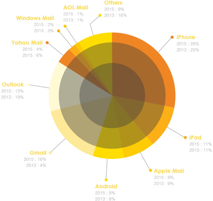
Source: emailclientmarketshare
How are the devices used throughout the day?
As compared to 2013, viewing patterns haven’t seen a drastic change! Smartphone usage
remains high during early morning and early evening. The usage of desktop for late evening
email views has decreased and has almost been replaced by smartphone or tablet.
2013 viewing pattern
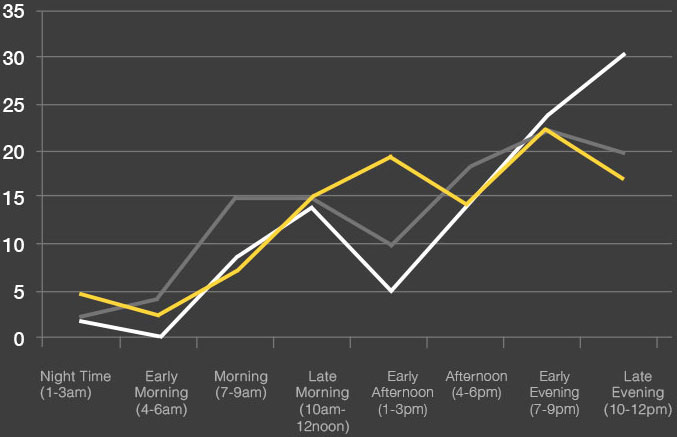
 % of Emails viewed on Mobile
 % of Emails viewed on Desktop
 % of Emails viewed on Tablet
Source: Comscore
2015 viewing pattern
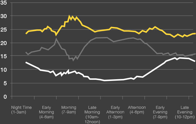
- % of Emails viewed on Mobile
- % of Emails viewed on Desktop
- % of Emails viewed on Tablet
Source: marketingland / movable ink
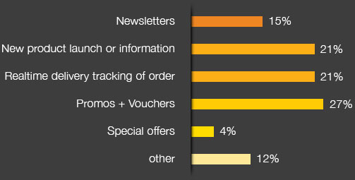
What motivates people for
mobile opt-ins through email?
While most people responded discounts in 2013, it still holds the same weight in 2015 too!
2013 Optin reasons
Source: Edialog “The future of mobile messaging” (2011)
2015 Optin reasons
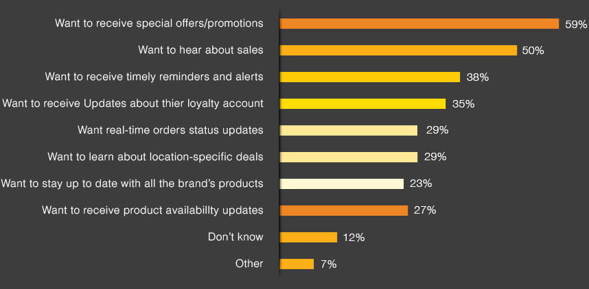
Source: Responsys Engagement study
And, if you are already using the mobile bandwagon,
here are things to avoid!
According to one of the recent reports from LiveClicker and The Relevancy Group
“Exploring the Benefits Real-Time Email – Driving Marketing Effectiveness” (2015)
below are the reasons respondents mentioned for not engaging with company's emails.
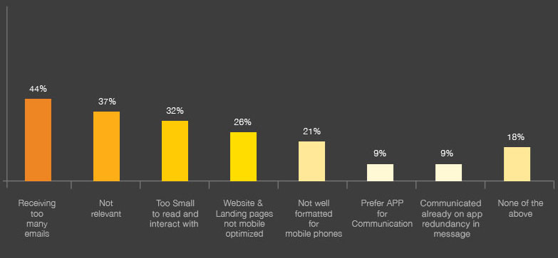
So, avoid sending too many emails and make sure they are optimized for
small screens as well as relevant enough.
Good Part – According to one recent survey,
Many marketers plan to adopt or
have already adopted responsive emails!
So, if you too want to embrace responsive emails,
below are some best practices,
you should follow.
Responsive Email Design Best Practices
-
1
Design in a single column so that it looks flawless even on clients like gmail app.
-
2
Design with finger targets in mind. Keep the width to a minimum of 320 to 550 Px, especially for small screen optimization.
-
3
Keep the CTA easily tappable with a minimum size of 44px.
-
4
Use white-space wherever possible so that readers can skim through the content easily.
-
5
Keep the header clean. Put the navigation (if any) in the footer. This will let users see the main information in the first scroll.
-
6
With increasing Apple loyal readership, make sure your mobile email is optimized for retina devices.
-
7
Don’t crowd links together and if possible keep text links in different row and convert them to buttons for mobile view.
-
8
Provide tappable (Call to function) phone numbers for mobile letting the users call whenever they need directly from a single tap.
-
9
Limit subject lines to 30 characters or less.
-
10
For the desktop view, use image width of minimum 480 Px. So that when the same is scaled on mobile it doesn’t get blurred.
-
11
If you are a beginner don’t just scale images, but use swap in your media queries
-
12
Restrict the height of your mobile emails, as subscribers like to skim through shorter emails else they skip reading.
-
13
Keep all the important CTA above the fold.
-
14
Test your responsive email design and make sure it is compatible across the major email clients.
Uplers helps email marketers double their email ROI by designing and coding beautiful responsive emails, newsletter templates and landing pages.
Get in touch - email.uplers.com
Check out our previous mobile email infographic here
https://email.uplers.com/infographics/responsive-email-design-mobile-templates/